
Trending Interior Paint Colors for Renton, WA Homes
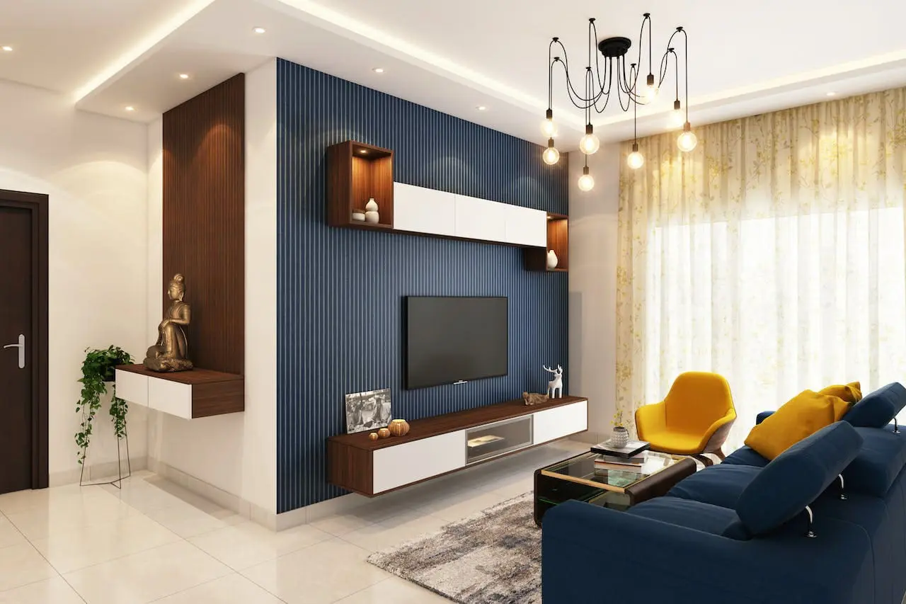
Trending interior paint colors are getting warmer, softer, and more rooted in nature. If you own a home in Seattle or Renton, that shift matches the evergreens and gray skies outside your windows.
Still, a trendy name tells you little until you see it on your wall. This guide names exact shades in each color family. It also explains how they behave in Northwest light and where each one fits best.
What Makes an Interior Color Trend Right Now
Three ideas shape most of the shades paint brands promote today. Knowing them helps you pick a color that outlasts the headlines:
- Muted over bright: Grayed, smoky tones feel calmer than clear, saturated ones.
- Warm over cool: Undertones of brown, yellow, and red are replacing icy blue-gray.
- Nature-led: Greens, clay, and wood-like browns bring the outdoors in.
Each section below names real shades you can sample. The codes come from the brands, so you can ask for them by name.
Warm Neutrals That Replace Cool Gray
Warm neutrals form the backbone of the trend. They work in nearly every room and pair easily with wood floors.
- Universal Khaki (Sherwin-Williams SW 6150): A warm, earthy neutral that suits living rooms and hallways.
- Melodious Ivory (Dutch Boy 3132DB): A soft, versatile off-white that keeps a room bright without feeling stark.
- Hazelnut Crunch (Clark+Kensington 09A-5): A deep, earthy neutral for rooms that want more depth.
Warm neutrals suit this region because gray daylight cools every wall. A warm undertone balances that effect, so the room feels cozy instead of cold. You can learn more in this guide to color temperature and home ambiance.
Pair these shades with black hardware, natural wood, and one deep accent. Add texture through linen curtains or woven rugs so the neutral never feels flat.
Muted Greens for Calm Rooms
Green is the strongest family right now, and it fits the Northwest naturally. Start with these shades:
- Warm Eucalyptus (Valspar 8004-28F): A green with warm undertones that feels soft in bedrooms and living rooms.
- Secret Safari (Glidden PPG1110-4): A botanical yellow-green that looks deeper in low light.
- Celery (Sherwin-Williams SW 6421): A pale, airy green with yellow undertones and a light reflectance value of 71.
- Webster Green (Benjamin Moore HC-130): A classic midtone green that suits home offices, built-ins, and front doors.
Test Secret Safari in your darkest room first. Because it looks deeper in low light, it may read heavier than the chip suggests. Celery does the opposite and brightens a shaded kitchen.
Greens pair well with warm white trim, brass fixtures, and oak. Avoid pairing them with cool gray, which can make the green look dull.
Smoky Blues and Jade Tones
Blue is back, but it looks quieter than the bright coastal blues of the past. These shades lead the family:
- Hidden Gem (Behr N430-6A): A smoky jade that blends blue and green.
- Cottage Door (Valspar 8004-38E): A steely midtone blue with a light reflectance value of 26.
- Artifact (Glidden PPG10-16): A muted, smoky blue with a light reflectance value of 20.
- Day Spa 0634 (Rodda Paints): A calming blue with a soft aqua undertone, from a Northwest paint brand.
These shades suit bedrooms, bathrooms, and home offices. They look best beside white trim, natural wood, and stone.
Deep and Moody Shades for Statement Walls
Dark colors add drama, and several brands now lean into them:
- Silhouette (Benjamin Moore AF-655): A dark espresso with burnt umber and charcoal undertones.
- Warm Mahogany (Glidden PPG1060-7): A warm red that suits bedrooms, kitchens, dining rooms, and home libraries.
- Deep Rooted (Dutch Boy 311-7DB): A saturated terracotta with a light reflectance value of 17.
Dark colors need care in gray light, since they can swallow a dim room fast. Use them on one wall, or in a small space you want to feel cozy. Pair them with white trim and warm bulbs.
Best Trending Colors by Room
Match the shade to the job each room does:
- Living rooms: Universal Khaki, Warm Eucalyptus, or Webster Green.
- Bedrooms: Cottage Door or Hidden Gem for calm, Warm Mahogany for drama.
- Kitchens: Celery or Melodious Ivory on walls, Webster Green on cabinets.
- Bathrooms: Day Spa, Hidden Gem, or Celery.
- Home offices: Silhouette, Artifact, or Webster Green.
- Dining rooms: Warm Mahogany, Deep Rooted, or Secret Safari.
Bathrooms need extra care, since steam can lift paint in a poorly vented room. Read about keeping bathroom paint from peeling before you repaint.
Fresh color also needs clean, patched walls. Review prepping your home before painting so the finish looks as good as the chip.
If you would rather hand off the work, interior painting in Renton crews handle the prep and the finish.
Pairing Trending Colors With Your Existing Finishes
Your floors, counters, and cabinets stay put when the walls change. Choose a color that works with them:
- Oak or maple floors: Warm greens and Universal Khaki feel natural beside the golden tones.
- Dark walnut floors: Lighter shades like Melodious Ivory or Celery keep the room from feeling heavy.
- Gray vinyl or tile floors: Add warm neutrals to offset the cool surface.
- White countertops: Almost any trending shade works, so choose by mood.
- Painted cabinets: Match the wall undertone to the cabinet color so the room looks intentional.
Hold a sample next to your largest fixed surface before you commit.
Matching Trends to Your Home’s Style
Seattle and Renton homes range from 1920s craftsman bungalows to mid-century ramblers and new townhomes. Each style leans toward different shades:
- Craftsman bungalows: Webster Green, Warm Mahogany, and Universal Khaki echo the wood trim and built-ins.
- Mid-century ramblers: Warm Eucalyptus, Hidden Gem, and Melodious Ivory complement large windows and wood paneling.
- New townhomes and condos: Celery, Cottage Door, and Artifact add character to plain white boxes.
- Homes with original woodwork: Choose colors that flatter the trim instead of fighting it.
Making Trending Colors Flow From Room to Room
Open floor plans often show three or four rooms at once. Colors that clash at a doorway make the whole house feel choppy. Use these tips:
- Share an undertone: Keep every wall warm or every wall cool.
- Repeat one neutral: Use Universal Khaki or Melodious Ivory as the base, and save bold shades for single rooms.
- Change at natural breaks: Switch colors at corners, doorways, or built-ins, never mid-wall.
- Keep trim consistent: One white trim color ties different wall colors together.
Choosing the Right Sheen for Each Color
Sheen changes how a color looks. Higher sheens reflect more light and show more wall flaws. Lower sheens look softer and richer:
- Flat or matte: Hides flaws and makes deep shades look velvety. It suits ceilings and low-traffic rooms.
- Eggshell: Adds a gentle glow with good durability. It works well in living rooms and bedrooms.
- Satin: Wipes clean easily, so it suits kitchens, hallways, and bathrooms.
- Semi-gloss: Resists moisture and wear, so it works on trim and cabinets.
Deep colors in a glossy sheen highlight every dent. Choose a lower sheen for dark walls unless you want that dramatic look.
How Seattle and Renton Light Changes These Shades
Long, gray winters change how every color looks. Keep these points in mind:
- Gray daylight cools colors, so warm undertones keep a room balanced.
- North-facing rooms darken every shade, so lean lighter and warmer.
- Light reflectance value (LRV) tells you how much light a color bounces back. Celery reflects a lot, while Silhouette absorbs most of it.
- Evening bulbs matter, since warm bulbs make greens and browns glow.
Window size and tree cover change the picture too. This post on how paint colors influence natural light explains the effect in more detail.
How to Test a Trending Shade Before You Buy
A paper chip cannot predict how a color will look at home. Follow these steps instead:
- Buy sample pots, not paper chips.
- Paint two-foot squares on at least two walls.
- Add a second coat so the color reads true.
- Check the samples in morning, afternoon, and evening light.
- Hold each sample beside your floors, trim, and counters.
- Wait three days before you decide.
If you shop a different brand, ask for a close match. Behr Caraway Seeds (S330-2) sits very close to Celery, and Sherwin-Williams Jadite (SW 6459) sits close to Webster Green. Cross-brand matches are never identical, so always check a physical sample.
For more guidance, read about choosing the perfect paint color for your space. For a wider look at palettes, see these paint color trends for Washington homes.
Common Questions About Trending Interior Paint Colors
What is the most popular interior paint color right now?
Warm neutrals and muted greens lead the market. Universal Khaki, Warm Eucalyptus, and Celery all reflect that direction. Popularity varies by brand, so sample two or three before you choose.
Are dark paint colors a good idea in Seattle homes?
They can work in the right room. Choose a space with good lamps or large windows. Limit deep shades to one wall if the room is dim. Add warm bulbs to keep the mood cozy instead of heavy.
What color should I paint a north-facing room?
Choose a warm, light to midtone shade, such as Universal Khaki or Melodious Ivory. These colors reflect more light and offset the cool daylight that north windows bring.
Can I use a trending color in a small room?
Yes. Light shades like Celery help a small room feel open. Deep colors can also work, as long as you commit to the whole room and use warm lighting.
How do I match a color from another brand?
Bring the chip or color code to a paint store. Staff can scan it and mix a close match. Test that match on your wall first, since results vary by brand and base.
Should I repaint gray walls that still look fine?
Only if the gray clashes with your light or your furniture. Cool gray can feel cold in a north-facing room. A warm neutral or muted green can refresh the space without a full redesign.
Do trending colors cost more to paint?
Color choice rarely changes the labor. Cost depends on prep, wall condition, and the number of coats. Deep colors may need an extra coat or a tinted primer.
Pick the Shade, Then Prove It on Your Wall
The best trending color is the one that works in your own light. Warm neutrals, muted greens, and smoky blues all suit the Northwest, but only a sample on your wall proves it. Test first, then commit with confidence. When you start budgeting, read what affects interior painting costs in Renton.
If you want help choosing and applying the right shade, we can guide you through it. Equipped Painting serves Renton, Seattle, and nearby cities with careful prep and clean finishes. Request a quote and our team will take it from there.