
Using Color Theory to Transform Indoor Living Spaces
Color isn’t just decoration. It shapes how a room feels, whether open or tight, calm or busy, energizing or restful. So when it comes to your living spaces, picking the right paint color is more than just choosing whatever’s trendy or popular. It’s about how everything fits together and how each room works for your life.
Basic color theory offers simple ways to make good choices before starting an interior house painting project. Whether you’re updating one space or considering a whole-home refresh, understanding how color relationships work can help the final look feel more natural, balanced, and personal. Let’s explore how this applies room by room, and what to think about before painting begins.
Understanding the Basics of Color Theory
Color theory helps explain how different shades work together. It’s a big topic, but here are a few grounding ideas that are helpful when making paint choices.
First, there are three groups of colors. Primary colors (red, blue, yellow) are the base. Secondary colors are made by mixing two of those (like red and blue make purple). Complementary colors sit across from each other on the color wheel, like blue and orange. When used together, complementary colors create contrast and help details stand out. They can add energy in active spaces or make a room more playful.
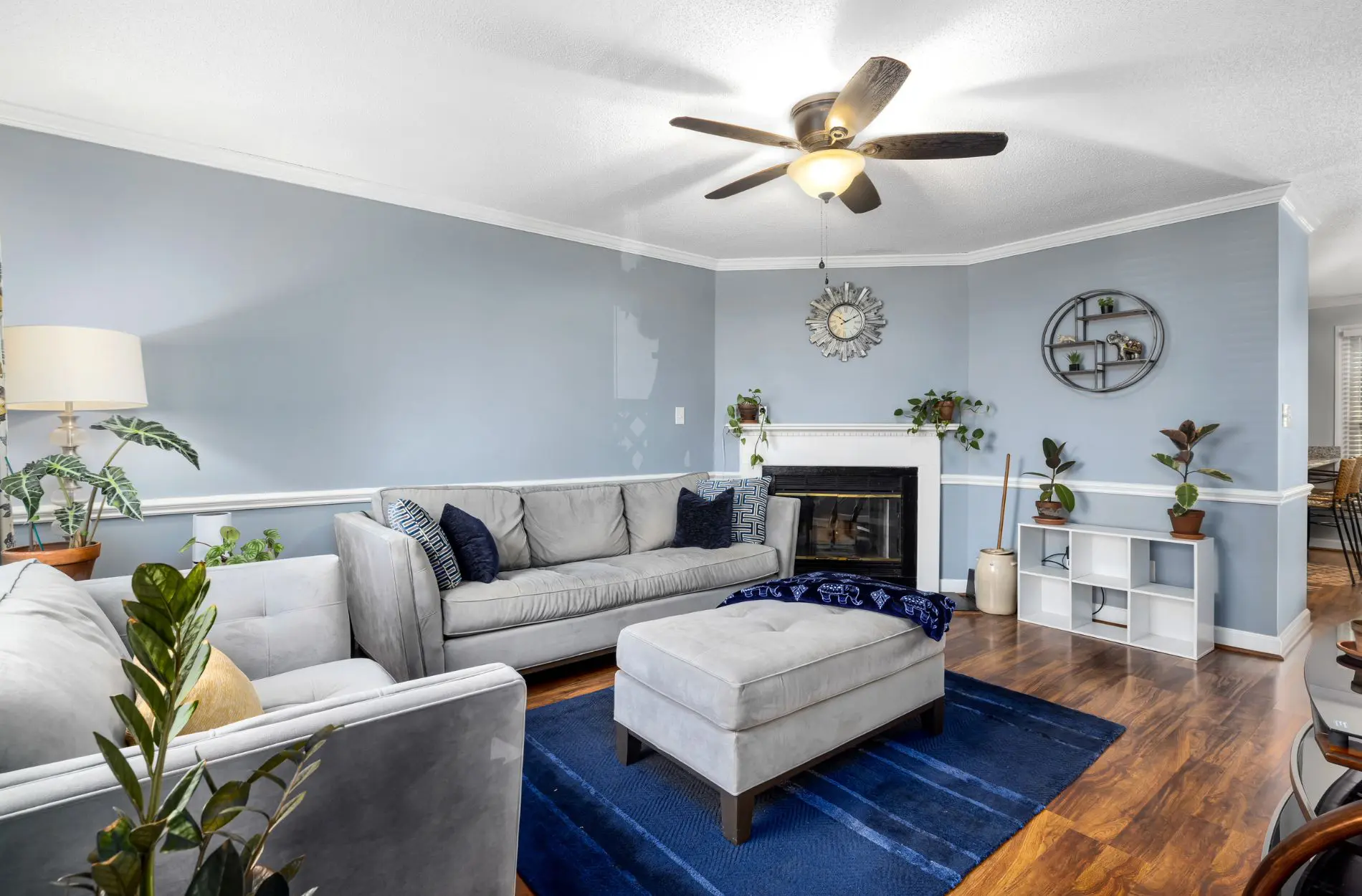
Warm tones include reds, yellows, and oranges. These tend to make a space feel cozier or more welcoming. Cool tones, like blues and greens, are calming and can make rooms feel open or airy. Not every room needs just one or the other, but knowing the difference makes it easier to decide what fits best for each room’s purpose.
The last part to think about is saturation and brightness. Deep, bold colors often feel more dramatic. Soft, lighter tones usually feel peaceful. Even with the same hue, small changes in how strong or light a color is can shift a room’s entire feel.
Choosing the Right Colors for Your Living Spaces
When choosing color, start by asking how you want each room to feel. The right shades should match what happens in that space.
For bedrooms or quiet reading nooks, soft blues, gentle greens, or muted purples tend to bring a peaceful feeling. These cool tones usually support better rest and focus. On the other hand, kitchens, dining spaces, and common areas often do well with warmer tones, like soft golds, terracotta, or warm beige, that help people feel more connected and energized.
A large, bold color across all four walls can take over a room. That’s where accent walls help. Adding a bold color to one wall, or using rich hues on doors or trim, can bring personality without overwhelming the space.
If you have an open floor plan, try using color flow to keep things connected. That doesn’t mean every wall has to match, but rooms should shift gently from one tone to the next. Painting your living and dining areas with colors from the same family makes the whole layout feel more unified.
How Lighting Affects Paint Color
Same paint. Same wall. Different light. That’s how much lighting matters. It can turn a cool blue into a dull gray or make a bright white look yellow.
Natural daylight usually shows a paint’s true color best. North-facing rooms can feel cooler, while southern light makes colors look warmer. Artificial light makes a difference too. Warm bulbs can highlight yellows and reds, while daylight bulbs can strip depth from darker tones.
Testing paint samples at different times of day is always a good move. Paint a few sections on the wall and check how they look in both morning and evening light. Look at how colors play against furniture, flooring, and art too.
When planning an interior house painting project, clear communication about how you expect a color to look, and what lighting the room gets, is key. Working with professional painters can help avoid surprises. They can suggest the right finish and guide color choices based on the room’s light setup.
Tying Color Into Your Interior House Painting Plan
Choosing colors isn’t a separate step. It’s part of the full interior house painting plan. The best results come when color, prep, and finish all work together.
Start by thinking about more than just walls. Trim, ceilings, and accent features may need to be painted to match or contrast with the main color. Certain shades take more coats, especially bold or dark ones. Sharing these plans with your painters helps them bring the right supplies and timeline so your project goes smoothly.
Residential painting services can also help with aligning paint choices to finishes. For example, matte works well in low-traffic zones, while satin or eggshell may be better for high-touch areas like hallways. The right match helps color show more consistently and hold up over time.
When color plans are confirmed early, it means fewer delays and more accurate results once painting begins. Everyone’s on the same page before the brush hits the wall.
When Neutral Colors Work—and When They Don’t
Neutrals can be great tools, but using them well takes some thought. A white wall can make a room feel fresh, clean, and open, but too much white, beige, or gray can make a space feel flat or empty.
That doesn’t mean neutral is bad. Neutral colors are perfect when you want your furniture or wall art to stand out. They’re often the safest choice for resale or long-term use.
But if everything in the room is light gray or off-white, nothing stands out. One way to fix that is by playing with undertones, like a gray with a tiny hint of blue, or a beige with a warm blush. Another option is texture. Layering materials such as wood, linen, or stone helps bring depth to neutral walls.
Accent colors can also be added through trim, doors, or ceiling features. The room stays neutral, but it no longer feels empty.
Bring Your Space Together with Color Confidence
Paint may seem like a simple update, but the right color can change how a space looks, feels, and works. Color theory gives reliable ways to make your decisions easier and more connected to how each room is used.
Choosing colors with purpose, and thinking about lighting, furniture, and room flow, makes everything come together naturally. When there’s a clear plan in place, the painting itself is faster and more precise. The result feels complete, and your home becomes more comfortable to live in and enjoy every day. For more help with choosing colors before your project starts, take a look at how we guide homeowners in the blog on How to Prepare Your Interiors Before the Painters Arrive and how we help with What to Look for in a Residential Painting Service. If you’re thinking ahead to more seasonal maintenance, we’ll cover even more solutions in upcoming blogs like Professional Solutions for Water-Damaged Interior Walls.
Planning out layout, lighting, and finishes before painting starts can make a big difference, and we’re here to help make each space feel just right. Our approach to interior house painting blends practical prep with clear design ideas that fit the way you actually use your home. At Equipped Painting, we focus on easy-to-live-in results that feel pulled together and purposeful.


